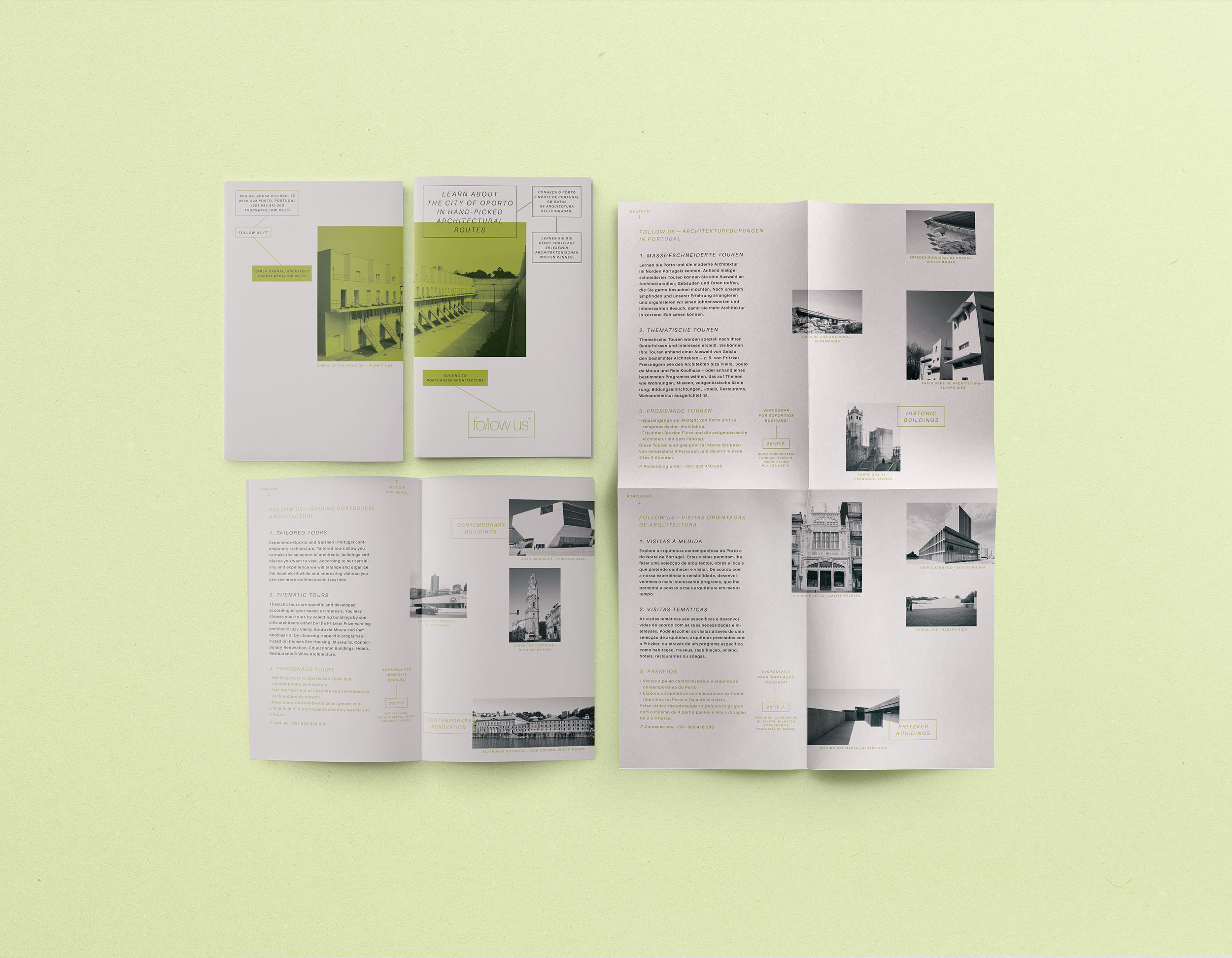
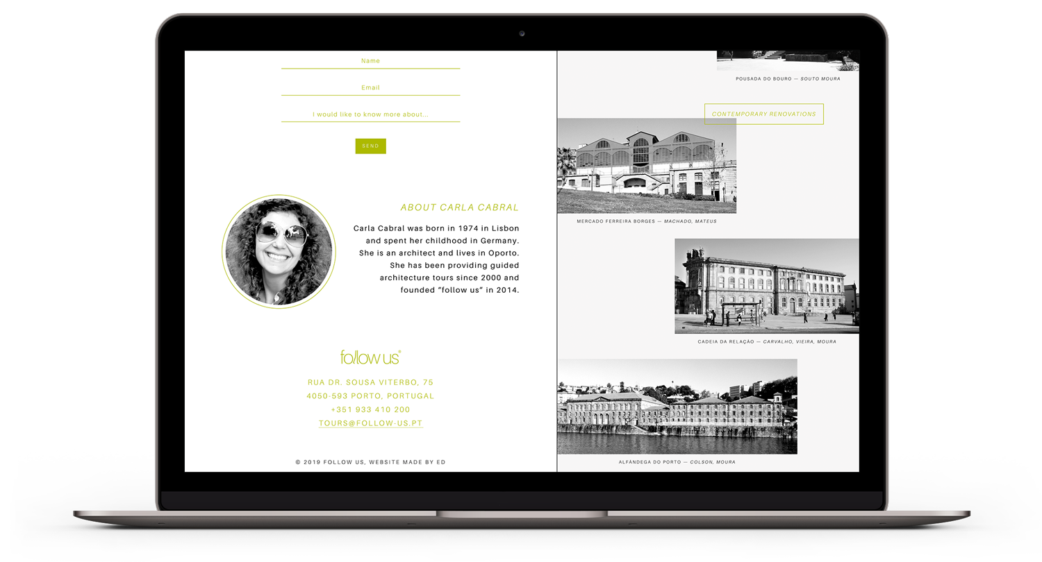
“Follow us” offers tailored architectural tours in Porto and North of Portugal by the local architect Carla Cabral.
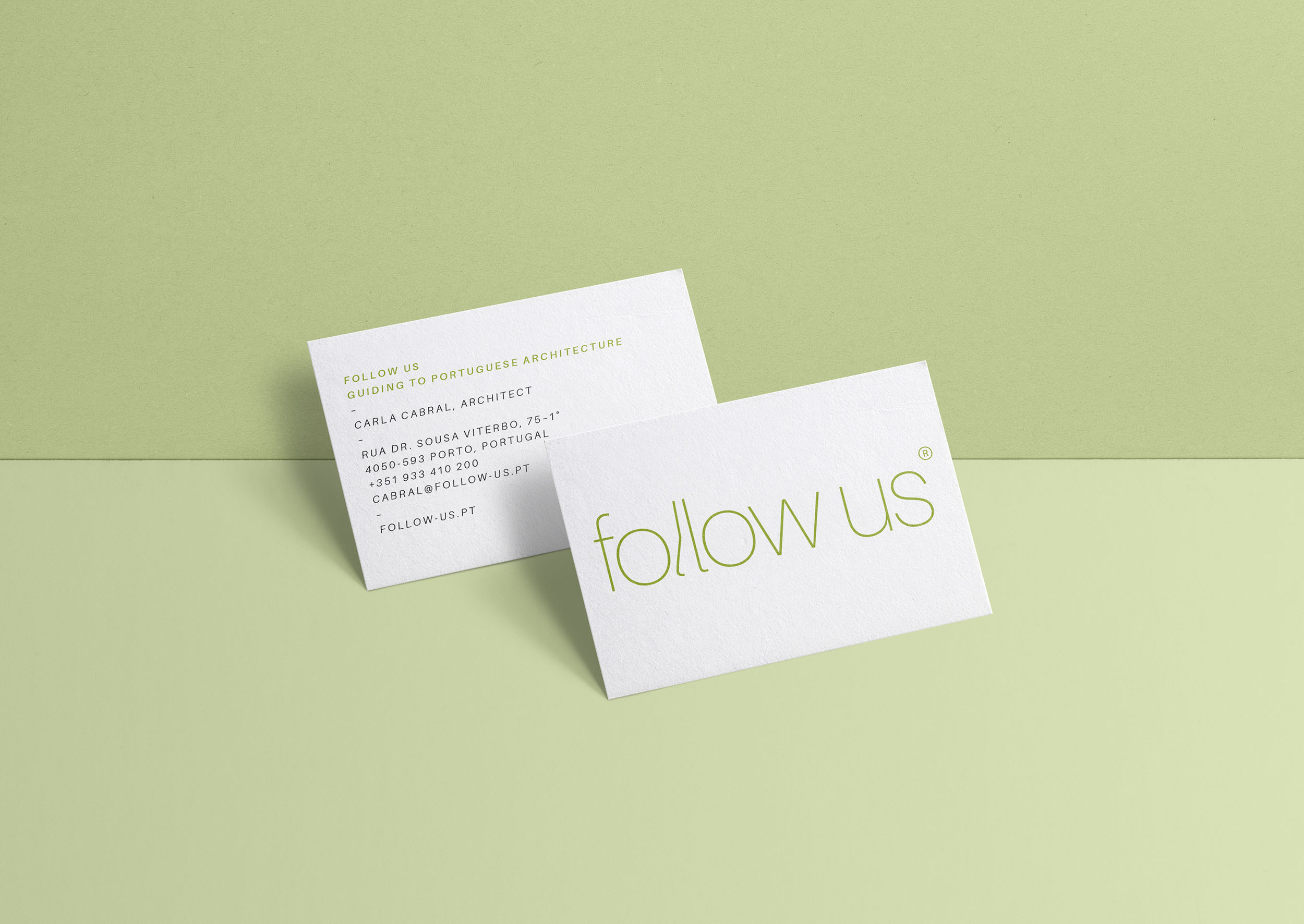
Carla asked us to create an identity different from what is commonly associated with city tours (lots of colors and effects, kitschy images and big typography). We should aim for simplicity and clarity instead.
For the logo, we used the Helvetica like typeface “Aileron”, designed by the Japanese type designer Sora Sagano. We kept it purely typographic but with a little tweak —replacing Ls by walking legs. The color scheme consists of green, black and white.
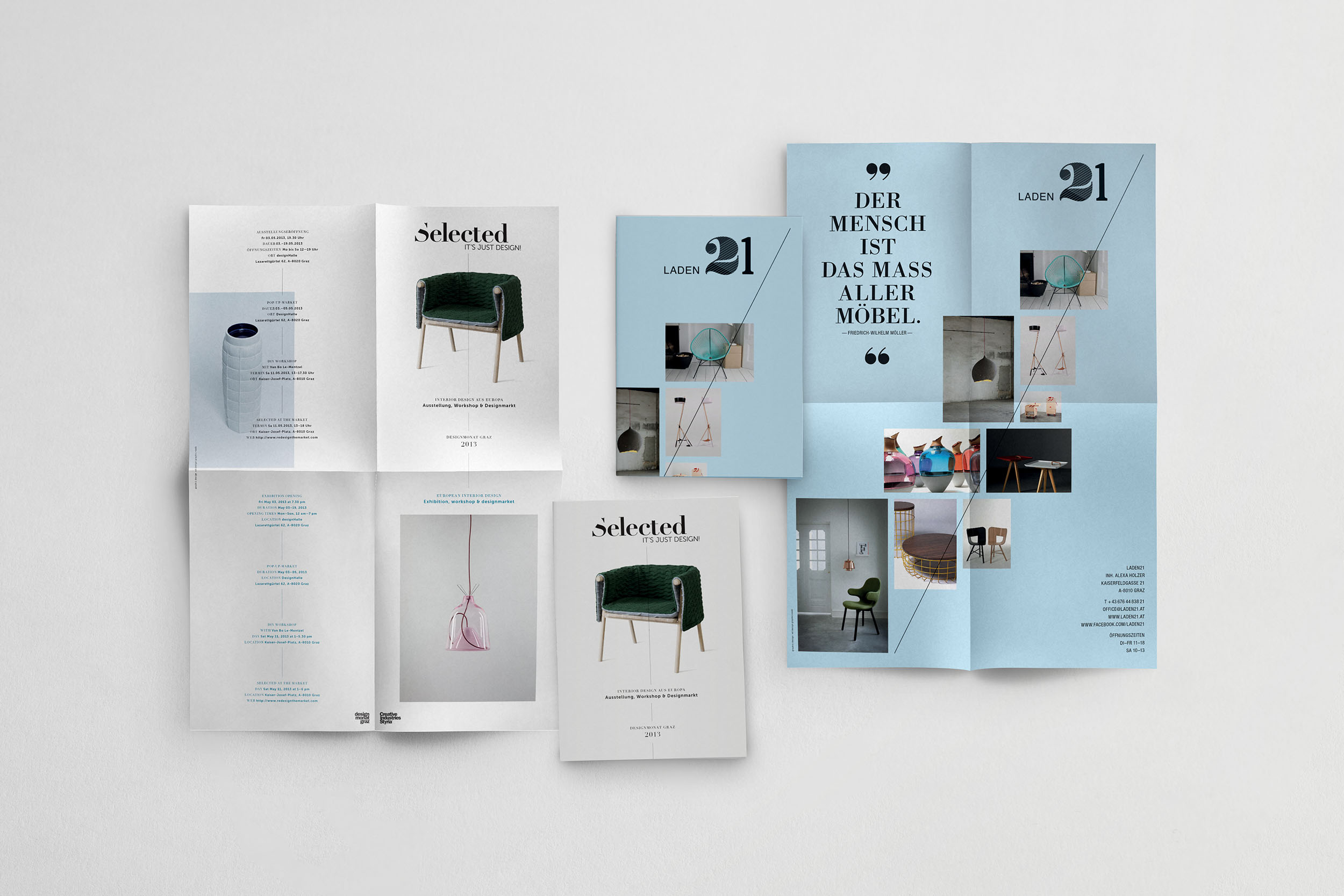
For the flyer, we used a large paper format folded in four to fit the handy Moleskine format. The information is provided in three languages and organized in two columns, text on the left and images on the right.
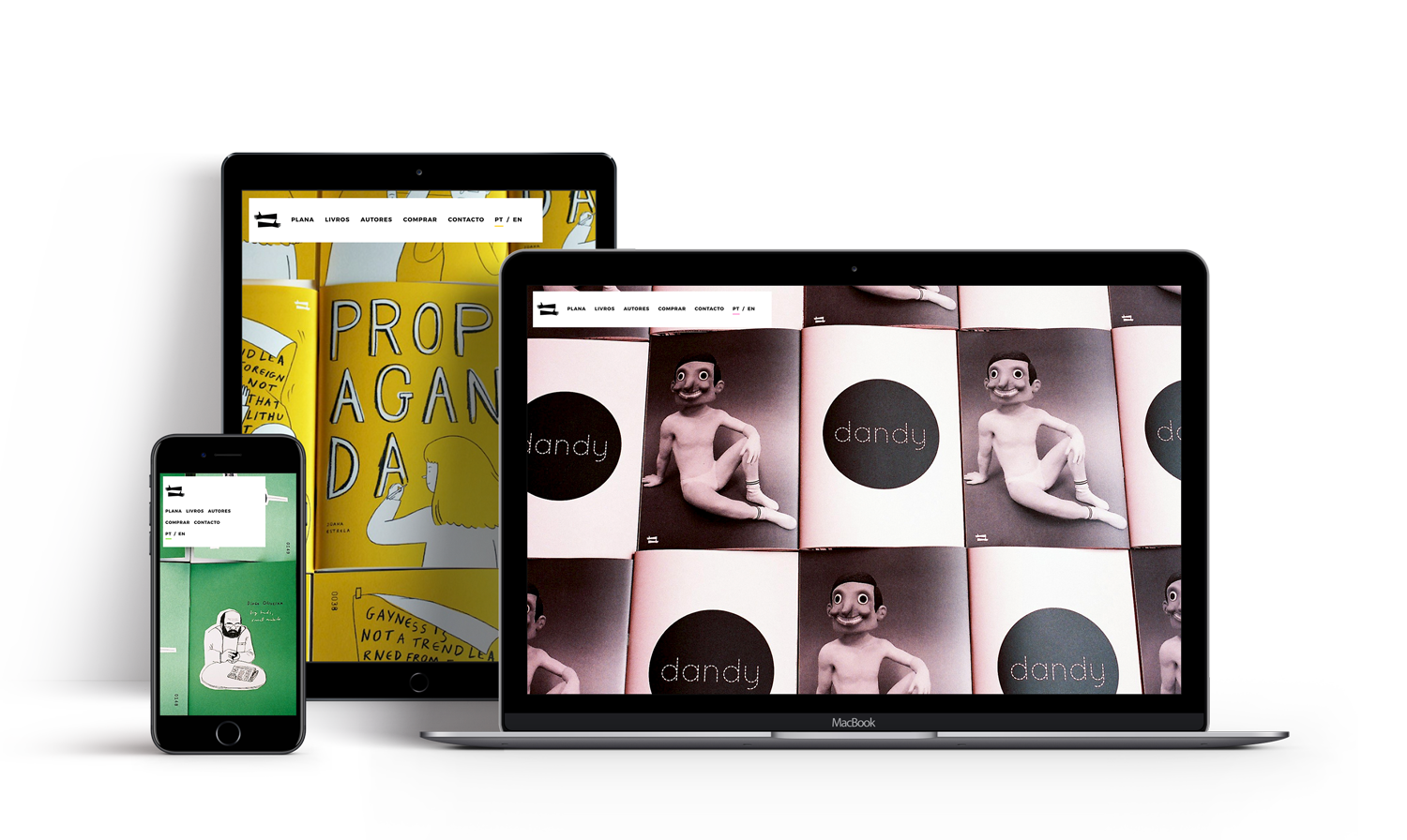
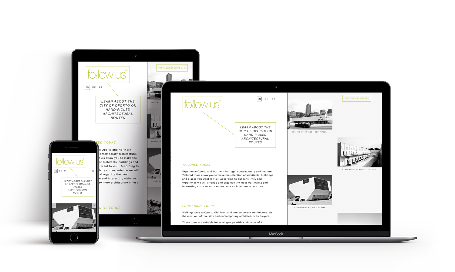
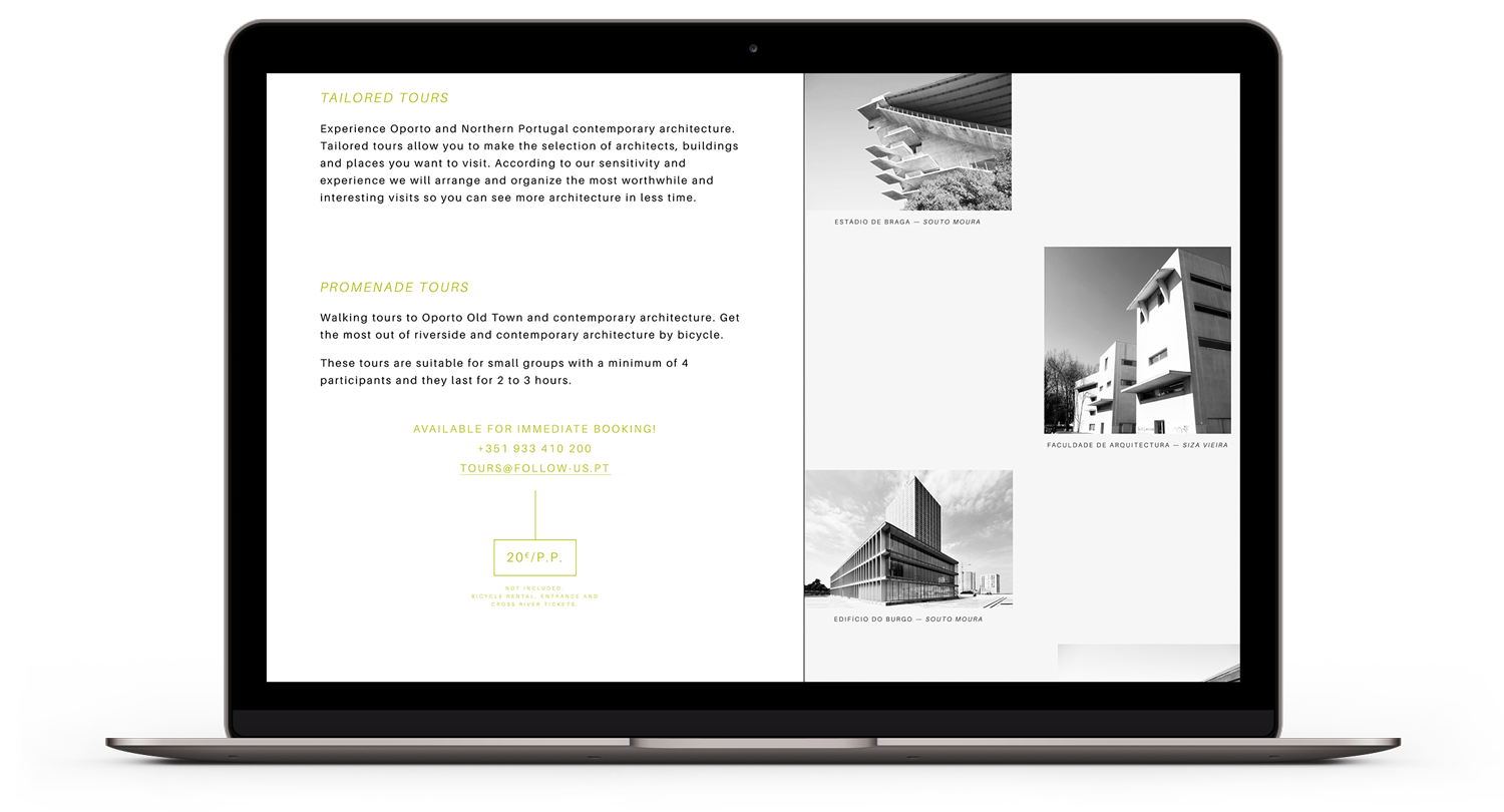
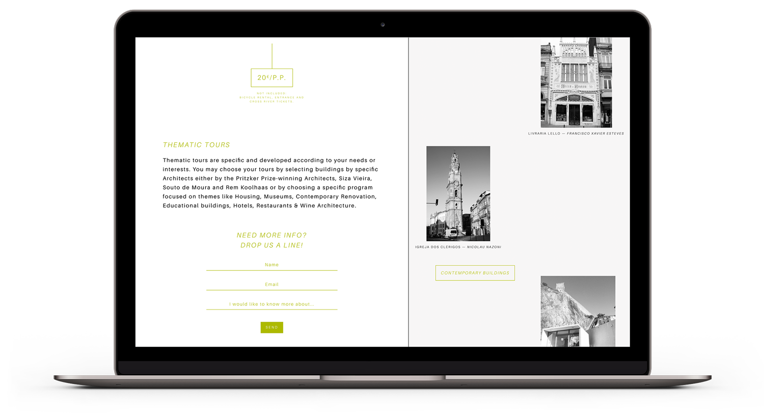
The website is a simple one-pager, coherent with the visual identity. Like the flyer, the content is divided into two columns, and they scroll at different speeds to compensate the different heights. We focused on bringing the typographic care and details, such as rectangles, from the printed material to the screen.
